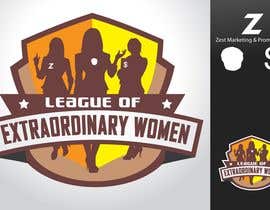
Logo Design for League of Extraordinary Women
- Stav: Closed
- Odměna: $290
- Přijatých návrhů: 22
- Vítěz: taks0not

Instrukce k soutěži
An illustrative comic style logo for a new group targeting young female entrepreneurs.
Doporučené dovednosti
Veřejná nástěnka k vyjasnění projektu
-

Pořadatel soutěže - Před 12 let
Hi everyone, thanks for your patience - just to let you know, we are having a meeting and will be choosing the winning design today. Thanks again for all your efforts... stay tuned. :)
- Před 12 let
-

taks0not
- Před 12 let
Wow! good luck everyone :))
- Před 12 let
-

hmwijaya
- Před 12 let
Please review #52 and #53 . Thanks...
- Před 12 let
-

ura
- Před 12 let
@sriegelhuth
I'm late for 2 minutes :(
not sure if I'm doing well, just take a look at:
http://www.kombinat.ua/test/uralabs/ura-sample1.png
Ura- Před 12 let
Zobrazit 1 další zprávu
-

AkashSikh
- Před 12 let
lol designpassionate should join dis league...
- Před 12 let
-

juls5
- Před 12 let
#68 with removable watermark :)
- Před 12 let
-
Pořadatel soutěže - Před 12 let
Designers... I think the main problem we are facing with these are the pictures, and the detail you are giving the 'girls'. Please google 'Hed kandi' .... (ignore the fact that the hedkandi cartoon girld have little clothes on) but the style of the cartoon drawing is VERY simple which looks more professional and modern. I think the main issue here is they all look too complicated.
Think a little more 'classy, and 'young and modern'
This logo needs to have the fun element but be considered professional!- Před 12 let
-
hmwijaya
- Před 12 let
Thank you, and you may want to revise your brief, and change the "superhero-comic style" to "glam vector illustration style" (I think that's the style of Hed Kandi)...
- Před 12 let
-
AkashSikh
- Před 12 let
i can totally understand you but i am not to crazy about illustrator!!
- Před 12 let
-

nazim2012
- Před 12 let
This contest is so BEAUTIFUL just like the CONTEST HOLDER.
- Před 12 let
-
AkashSikh
- Před 12 let
??? lol bad choice!!
- Před 12 let
-

Woolsey
- Před 12 let
withdrew prev-replaced with #44 #45 #46. Will work on simplifying girls-really have to start over & from the photographs provided not an easy task. (Black & white high resolution photos would work best for future reference).-will go to sugested sight-Thanks & have a great day!
- Před 12 let
-

olaymi89
- Před 12 let
hello please give me feedback #42 and #41
- Před 12 let
-

sayeedgt
- Před 12 let
see my another experiment.#34
- Před 12 let
-
sayeedgt
- Před 12 let
Check it too #39
- Před 12 let
-
Woolsey
- Před 12 let
Hello there! Here is revised logo. #32 is new logo/cleaned w/new fonts #33 shows all variations shadow on text on logo, flat text (color) on top right & B&W variations. Please rate & your comments are helpful.Thank you & have a GREAT day!!
- Před 12 let
-

votrix
- Před 12 let
please tell more changes & view for #9
- Před 12 let
-
hmwijaya
- Před 12 let
Please review #26 and #27, they are one package with the LXW as the primary logo. It has designed so it looks clear and sharp in one color (for prints/letterheads/etc).
- Před 12 let
-
Woolsey
- Před 12 let
replaced 24 with #25
- Před 12 let
-
Pořadatel soutěže - Před 12 let
You will need to spend a bit more time on the font/words. Need to be very clear and flat colours, no shading. Needs to be something that will look dynamic on its own.
- Před 12 let
-
Pořadatel soutěže - Před 12 let
Thanks everyone for your entries so far. The most important thing is a very clean illustration of the girls, wearing normal clothes. The font and words need to be together encased in some kind of border, move away from the banner/scroll that most of you are using and think stamp or something else that has impact.
The words need to be able to be used on their own as a simplified version of the logo.
Please do not create the women to look sexual, we are appealing to a female audience and do not need to turn them on! ;)- Před 12 let
-
crayoni
- Před 12 let
hello! can you make the contest 'sealed' please? that you'll have more varied entries since the designers can't copy from one another. >:D
- Před 12 let
-
Woolsey
- Před 12 let
Please see #23 & #24 . I edited the text & have one with regular clothes. Hope this works better for you! Have a great day...Signing off!
- Před 12 let
-

Kauleshwar
- Před 12 let
why is majority of people trying to put Wonder Women in it? o.o
- Před 12 let
-
Pořadatel soutěže - Před 12 let
hehe! Yes, no wonder woman please!
- Před 12 let
-
juls5
- Před 12 let
you want the logo with the faces of the girls, maybe only the upper part of the body? or the entire body? :D
- Před 12 let
-
Pořadatel soutěže - Před 12 let
whatever works, focus on good quality clean designs with attention to a good font, keep the words together
- Před 12 let
-
mazec
- Před 12 let
there goes my #5 , it takes a day to draw them.
- Před 12 let
-
mazec
- Před 12 let
no star though. Feedback please...
- Před 12 let
-
Pořadatel soutěže - Před 12 let
words need to be together so than can be used as a simplified version on their own. thanks for your hard work with the faces, try to simplify them and keep them clean and crisp. appreciate your entry.
- Před 12 let
-
Woolsey
- Před 12 let
Hey there. Please rate #22 & #20. Will edit where specified & Comments are welcome. Have a great day!!
- Před 12 let
-

elcolores
- Před 12 let
Hello Ladies, I would greatefuly appreciate it if you please take time to leave feedback on my artwork (#21) Thank You So Much. i will work with you untill you are 100% satisfied.
- Před 12 let
-
sayeedgt
- Před 12 let
please rate my design#18
- Před 12 let
-
Kauleshwar
- Před 12 let
why *ARE* ^^'
- Před 12 let
-
votrix
- Před 12 let
please rate #9 tell me any changes you want so that i can modify design in next atempt
- Před 12 let
-

mitrovili
- Před 12 let
Thank you for not rejecting my design..... Soon I'll come with another one that fulfills your demands
- Před 12 let
-
Pořadatel soutěže - Před 12 let
Also I have uploaded a couple of photos of lois lane to give you an idea of the comic style we are looking for. I would try to keep the illustrations simple, but clean, so avpid etching, too much shading, etc.
- Před 12 let
-
Pořadatel soutěže - Před 12 let
Hi everyone, I would like a large emphasis on the words and the format/font for the words and the border around the words, as they will sometimes be used on thier own. I see the words alone as being the simple form of the logo, to be used when the full illustration is not appropriate or too detailed. Maybe move away from the banner/scroll thing - I just used that as a quick mockup, something bold in block letters that can be used on letterhead in black and white would be great. Thanks
- Před 12 let
-
mitrovili
- Před 12 let
I will make one with normal clothes too
- Před 12 let
-
mazec
- Před 12 let
Illustrating face is different, in my opinion to emphasize your image slight larger head proportion will not reduce those beauty (I'am not flatters you up :)). You will see my entry soon.
- Před 12 let
-
Pořadatel soutěže - Před 12 let
I have uploaded a new picture - Sarah New. Will try to get a better one of Liz also. Heads in proportion with bodies please. :)
- Před 12 let
Jak začít se soutěžemi
-

Zveřejněte svou soutěž Rychlé a snadné
-

Získejte spousty návrhů Z celého světa
-

Zvolte nejlepší návrh Stáhněte si soubory - Je to snadné!