Optimize a logo

  • Stav: Closed
  • Odměna: $150
  • Přijatých návrhů: 32
  • Vítěz: JubairAhamed1

Instrukce k soutěži

I want to modernize our logo a tiny bit, flatten/simplify the text/remove gradient on the text-part of the logo and also get a high resolution version of the logo. See our old logo attached as logo_src.psd.

Primary target background: White / transparent
Primary target website logo size: About 60px heigth (max)
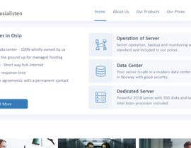
Primary location: See design of our NEW website attached, homepage.png.
Font: Century Gothic (or similar plain font that looks professional)
Colors: White, blue, gray (exactly like logo in homepage.png only in far better quality).

Try to make our new logo it similar to this and use homepage.png to show me the result of your logo:
https://kunde.webspesialisten.no/img/kunde.webspesialisten.no/logo.png

The logo will be mainly used at homepage.png attached, but it is also used on the link above here. The important place is homepage.png!
So create a fancy logo, put it on homepage.png and show it here. Main thing is white background and under 65px.

The colors and size between logo, text and text-lengt/heigth-ratio is close to perfect there.

Icon should be vertically centered on the text and keep space between

The logo must also work with a black and a blue background (similar to to how the blue in the text-logo part in "homepage.png" is. You may provide seperate images if needed (assume it is needed).

You can see where I want to use the new logo by looking at screenshot of "homepage.png" attached - our new website. I like the logo how it looks there on the screenshot, but it is just a bit bad quality because it has been changed from non-original source.

I have made an attempt here and I'm getting closer to what I want, but the W-icon is not as smooth as the original: https://kunde.webspesialisten.no. So I gave up.

The attached "homepage.png" has a "bug" in the bottom part in the icon-logo (the W-icon), in addition to beeing in bad quality and I have no high-quality version of it. But the size of things, colors etc. is correct direction and is better than the attached "logo_src.psd".

Attached is the original logo for our old website (https://webspesialisten.no), based on black background, layered in .psd and in high resolution "logo_src.psd". You will discover that the "W"-icon on front ot text is not change-able (not layered) and might need to be drawn again to deliver on this contest.

Contest-rules:
- Show approx 65px high version of the logo, preferable on the "homepage.png" design. Feel free to cut most of the page).
- Feel free to also show a big version of it as well here.
- I'm open to new design ideas around this, but my primary goal is to get something in the direction of what I got, in higher resolution and quality. So you migth waste your time if you do something very different.

Tips:
- Do not make the text to wide, the company name is long enough as it is.
- Do not make the "S" in WebSpesialisten bigger than it is. The normal way is Webspesialisten, but it looks better with a small difference like WebSpesialisten I think. Just don't make it bigger and do not add whitespace between Web and Spesialisten - again - it is one word.


Deliverable if you win:
- High quality, high resolution layered logo, with changeable text and colors in psd-format.
- Fav-icons/browser-icons.
- Any other source files that migth be good to have later (like if you draw something).
- Will also use the logo on Facebook.

Doporučené dovednosti

Zpětná vazba od zaměstnavatele

“Did a very good design-job of our logo.”

Profilový obrázek DeltaUser, Norway.

Nejlepší návrhy této soutěže

Zobrazit více příspěvků

Veřejná nástěnka k vyjasnění projektu

  • DeltaUser
    Pořadatel soutěže
    • Před 5 let

    Jubair A. have done so many suggestions/revisions and also the one who have gotten closest to what I want before I adjusted his suggestions. So this is a warning that I will close the contest soon and the way it looks now, he will win. So, if you have a design, submit it asp. Please don't just copy his design.

    • Před 5 let
    1. JubairAhamed1
      JubairAhamed1
      • Před 5 let

      I appreciate your comment. I would like you to see latest revision #111

      • Před 5 let
    2. DeltaUser
      Pořadatel soutěže
      • Před 5 let

      Commented :)

      • Před 5 let
  • markmael
    markmael
    • Před 5 let

    #100 thanks

    • Před 5 let
  • DeltaUser
    Pořadatel soutěže
    • Před 5 let

    To those who post wall-logos: They are all rejected, I'm not looking for a wall-logo. Show your logo on homepage.png or don't post here.

    • Před 5 let
    1. zubair141
      zubair141
      • Před 5 let

      sir please check #85

      • Před 5 let
  • zubair141
    zubair141
    • Před 5 let

    sir please check my entry #77 and #80

    • Před 5 let
  • DeltaUser
    Pořadatel soutěže
    • Před 5 let

    If you manage to have the second V in W in icon to white, with a dark(er) border around so it is visible, it will be what I prefer: https://kunde.webspesialisten.no/img/kunde.webspesialisten.no/logo.png - I really dislike a strong color on the 2nd V and avoid the really dark grey that gets a lot of focus. All the W-s I have seen are mostly think lines up in the air out of the circle. But if you look at our original logo or that customer area, it is much thicker.

    • Před 5 let
    1. WilliamPls
      WilliamPls
      • Před 5 let

      Hello, check #71

      • Před 5 let
    2. zubair141
      zubair141
      • Před 5 let

      sir please check my entry #77 and #80

      • Před 5 let
  • markmael
    markmael
    • Před 5 let

    #55 thanks

    • Před 5 let
  • WilliamPls
    WilliamPls
    • Před 5 let

    Hello check entry #24

    • Před 5 let
  • DeltaUser
    Pořadatel soutěže
    • Před 5 let

    Important: I see all of you have really share W-icon and I assume that is because you just do a "color-fill". This removes shades and borders and make the lines really thin when the icon is small. And not so good.

    • Před 5 let
    1. JubairAhamed1
      JubairAhamed1
      • Před 5 let

      All of mine are vector file, I can guarantee right now. Send a message and i send my illustrator file on message to you.

      • Před 5 let
  • DeltaUser
    Pořadatel soutěže
    • Před 5 let

    Please compare your W-icon to the one used here: https://kunde.webspesialisten.no/img/kunde.webspesialisten.no/logo.png - you all seem to make the edges more sharp and not so smooth. It doesn't look so good when the edges are so sharp.

    • Před 5 let
  • DeltaUser
    Pořadatel soutěže
    • Před 5 let

    Please keep a distance between the icon and the text. All entries so far have the text tight into the icon. Also try to center the W vertically on the text. So that the W-icon is just a bit higher and lower than the text.

    • Před 5 let
    1. DeltaUser
      Pořadatel soutěže
      • Před 5 let

      Entry 1-4 all have these problems here.

      • Před 5 let

Zobrazit více komentářů

Jak začít se soutěžemi

  • Zadejte vaši soutěž

    Zveřejněte svou soutěž Rychlé a snadné

  • Získejte kupu návrhů

    Získejte spousty návrhů Z celého světa

  • Zvolte nejlepší návrh

    Zvolte nejlepší návrh Stáhněte si soubory - Je to snadné!

Zadejte soutěž nyní nebo se k nám připjte ještě dnes!