dashlash2411
Serbia

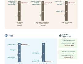
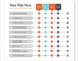
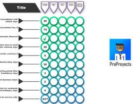
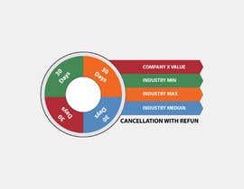
For my website, I am reviewing companies which offer a certain type of warranty. As a part of the review for Company X, a summary of essential terms is presented. Those are summarized in the first two columns of this file
https://docs.google.com/spreadsheets/d/1dkEWNAhux03JJc2zSpSONYZ_lexkXB_vAz70JLc4Ylw/edit#gid=0
I am looking for a way to create the visual representation of those numbers, relative to the industry benchmarks. Those are shown in the next 4 columns of the table:
Min, Max, Median, Average.
We use either Median or Average, no need to use both.
UPDATE: I am not looking for a full blown design for your entry, a sketch would do it.
“As always - pleasure to work with”
![]() Umnikey, United States.
Umnikey, United States.


Zveřejněte svou soutěž Rychlé a snadné

Získejte spousty návrhů Z celého světa

Zvolte nejlepší návrh Stáhněte si soubory - Je to snadné!
