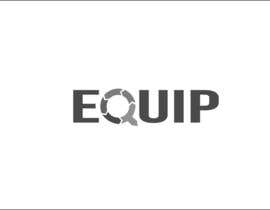
Design a text-based logo based on concept sketch
- Stav: Closed
- Odměna: $30
- Přijatých návrhů: 47
- Vítěz: marijanissima
Instrukce k soutěži
The attached file represents a first (ugly) pass at what we're looking for in a logo for an adult education program at our church.
Here's what we're trying to represent: We've broken up 2014 into several "tracks" (or time periods), and we're offering several classes during each track. We're encouraging attenders to pick one class each track to attend. The purpose of the classes is to equip individuals to serve with increasing effectiveness in a variety of capacities. The intention is to repeat this process in future years as well.
We're after something simple that communicates as many of the above ideas as possible. Deviations from the attached will be considered, as long as they meet the criteria we've laid out. The logo will be used in a lot of print materials, so if a design incorporates color, it should also look good in grayscale.
As we've discussed the attached concept, it's been agreed that a more bold font would be more effective. We're partial to Babas Neue (free download at http://www.dafont.com/bebas-neue.font). In addition, it might look better for the transition from dark to light colors to be a constant gradient rather than a stark change of shade from one arrow to the next.
Looking forward to your entries!
Doporučené dovednosti
Zpětná vazba od zaměstnavatele
“Excellent work.”
![]() solideo, United States.
solideo, United States.
Veřejná nástěnka k vyjasnění projektu
Jak začít se soutěžemi
-

Zveřejněte svou soutěž Rychlé a snadné
-

Získejte spousty návrhů Z celého světa
-

Zvolte nejlepší návrh Stáhněte si soubory - Je to snadné!


