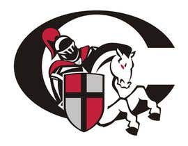
Illustration Design for William Carey University
- Stav: Closed
- Odměna: $290
- Přijatých návrhů: 21
- Vítěz: kimberart

Instrukce k soutěži
Athletic logo design for University. Crusader on Horse - Illustration.
Doporučené dovednosti
Veřejná nástěnka k vyjasnění projektu
-

ura
- Před 12 let
Strange activity... I'm withdrawing.
Good luck to others!- Před 12 let
-

lifeillustrated
- Před 12 let
WHERE CAN WE SUBMIT THE NEW PROPOSALS.....
- Před 12 let
Zobrazit dalších 4 zpráv
-

RedSteelBird
- Před 12 let
thanks for reply... check PM..
- Před 12 let
-

abrahamrdz
- Před 12 let
how do i send PM?
- Před 12 let
-
Pořadatel soutěže - Před 12 let
#32 has an interesting style but is way too detailed. Also, the shield should probably be in front of the crusader rather than having the crusader superimposed on the shield. The lance can be removed.
- Před 12 let
-

pinky
- Před 12 let
It can reduce lines and can come with more simple way. Can do it:)
- Před 12 let
-
Pořadatel soutěže - Před 12 let
#29 and #31 look to be the same design. Both are interesting but they are way too detailed and will not scale well. The circle is not needed around the logos. Neither is the sword.
- Před 12 let
-
pinky
- Před 12 let
I can make these simple within this . Simple lines that can be visible in small seal .
- Před 12 let
-
Pořadatel soutěže - Před 12 let
#25 , I can't really tell what I like about this logo because the images are way too small. I do know that the plume on the shield should be completely removed as should the sword. The shield doesn't need the tiny elements within the panels. It just needs the panels. Something seems a little odd with the helmet. Other than this this might be an interesting design.
- Před 12 let
-
abrahamrdz
- Před 12 let
i posted a simplified version here dont know if you miss it, also it doesn´t have the sword anymore
- Před 12 let
-
abrahamrdz
- Před 12 let
http://img705.imageshack.us/img705/9938/williamcareyu401.jpg
- Před 12 let
-
Pořadatel soutěže - Před 12 let
#7 has designs that are too small to be adequately reviewed. As with #7 , the plume on the shield and the sword need to go away. Also, the circle around the logo is distracting and should be removed.
- Před 12 let
-
Pořadatel soutěže - Před 12 let
#26 is way off base. Wrong colors. Wrong shield. However, general style and feel of the logo were pretty good.
- Před 12 let
-
Pořadatel soutěže - Před 12 let
#37 is similar to #39 and #40 . The dark black design is just way too much. I think this logo will work far better on a white background. The shield is also interesting. I meant to also say that, of the three logos, I like the open helmet best in #39 .
- Před 12 let
-
Pořadatel soutěže - Před 12 let
#34 , #35 , and #36 are way too detailed and will not scale well. They are also basically two color designs. The odd shape of the shield just doesn't seem to fit.
- Před 12 let
-
abrahamrdz
- Před 12 let
#28 & #27 still using material from shutterstock its just photosoped
- Před 12 let
-
Pořadatel soutěže - Před 12 let
Could you post the shutterstock url? #28 and #27 are way too complicated to be athletic logos. They are also some the least visually appealing of all the options presented.
- Před 12 let
-
abrahamrdz
- Před 12 let
here http://www.shutterstock.com/cat.mhtml?lang=en&search_source=search_form&version=llv1&anyorall=all&safesearch=1&searchterm=Knight horse&search_group=&orient=&search_cat=&searchtermx=&photographer_name=&people_gender=&people_age=&people_ethnicity=&people_number=&commercial_ok=&color=&show_color_wheel=1#id=19277134
- Před 12 let
-
Pořadatel soutěže - Před 12 let
The same comments generally apply to #38 as to #39 except that number 39 is the better of the two designs with the exception of the shape of the shield.
- Před 12 let
-
Pořadatel soutěže - Před 12 let
#39 is an interesting design but there is way too much emphasis on the horse. The horse is the least important element in the entire logo. However, the way the horse is styled is somewhat close to what we are looking for. There are thick curvey lines which gives the horse a softer feel. That is sort of what we envisioned for the entire logo. The really sharp points on the horses mane and on the crusader's plume are not good though as they will not scale well. The shield uses the pattern from the school's shield logo but the lines are way too thin. They would be better if they had the same stylized feel as the horse. Nice start.
- Před 12 let
-
Pořadatel soutěže - Před 12 let
#40 is interesting but is also too complex. It will not scale well down to black and white or grayscale or small sizes which was one of the requirements. Use of the Medieval type font is interesting but probably not something the client would be interested in. The sword should have not been included.
- Před 12 let
-
Pořadatel soutěže - Před 12 let
#41 is a good illustration but is way too complex.The shield also does not use the panels of the shcool's shield logo as was required. Finally, the requirement was to not have a sword. It is also not quite the style we are looking for, but I think the illustrator is talented.
- Před 12 let
-
Pořadatel soutěže - Před 12 let
Most all of the entires provided have far too much detail. Athletic logos are intended to make an emotional appeal. The human mind cannot form a connection with logos which are too complex. If we could simplify some of these logos it would probably make a big difference.
- Před 12 let
-
abrahamrdz
- Před 12 let
i simplified mine please take a look http://img196.imageshack.us/img196/6335/williamcareyu3.jpg
- Před 12 let
-
Pořadatel soutěže - Před 12 let
The most effective designs right now are the ones by Kimberart.
There is a tremendous amount of psychology behind logos. Basically, the first thing people notice in a logo is the shape. The more complex the shape, the more difficult the logo is to recognize. What we are looking for is a logo which people can easily recognize and associate with emotional events (i.e. sporting events). Here are links for athletic logos that might be worth looking at.
http://inventorspot.com/articles/the_top_10_best_sports_logos_15369 (Look at Toronto, Green Bay, Miami Dolphins**)
http://blog.sportscape.tv/2009/10/01/top_20_all_time_best_sports_logos/ (See Texas Longhorns, Chicago Bulls, and Washington Huskies.)
http://bleacherreport.com/articles/499895-100-coolest-sports-logos-of-all-time
Also, look at Chris Creamer's Sports logos site. There are good AND bad logos there. Worth a review. http://www.sportslogos.net/- Před 12 let
-
abrahamrdz
- Před 12 let
i simplified mine please take a look http://img196.imageshack.us/img196/6335/williamcareyu3.jpg
- Před 12 let
-

blackbelt33
- Před 12 let
sorry my one is #30
- Před 12 let
-
blackbelt33
- Před 12 let
#23 hundred percent my own art work and all elements in logo #23 are changable
- Před 12 let
-
RedSteelBird
- Před 12 let
kindly check my entry, #16 and #23 , thank you..
- Před 12 let
-
abrahamrdz
- Před 12 let
http://www.shutterstock.com/cat.mhtml?lang=en&search_source=search_form&version=llv1&anyorall=all&safesearch=1&searchterm=Knight horse&search_group=&orient=&search_cat=&searchtermx=&photographer_name=&people_gender=&people_age=&people_ethnicity=&people_number=&commercial_ok=&color=&show_color_wheel=1#id=19277134
- Před 12 let
-
abrahamrdz
- Před 12 let
WATCH OUT!
http://image.shutterstock.com/display_pic_with_logo/98191/98191,1224715246,6/stock-photo-knight-with-lance-and-on-horseback-19326691.jpg- Před 12 let
-
RedSteelBird
- Před 12 let
kindly check my entry, thank you..
- Před 12 let
-
rabregana
- Před 12 let
kindly make some comment. thanks!
- Před 12 let
-
rabregana
- Před 12 let
I'm sorry. I apologize. can I have one last chance? I have a design and it is mine this time.
- Před 12 let
-
Pořadatel soutěže - Před 12 let
No. We do not work frauds.
- Před 12 let
-

Oniria
- Před 12 let
watchout http://www.google.com.mx/imgres?q=crusader knight&hl=es&client=firefox-a&hs=sdj&rls=org.mozilla:es-ES:official&tbm=isch&tbnid=7I8rAXCJQYn3jM:&imgrefurl=http://www.fotolibra.com/gallery/49112/crusader-knight-on-horseback-illustration/&docid=iv21sRR3h2utUM&w=624&h=596&ei=PO86TsKvM4HagAeIpcXPBg&zoom=1&biw=1366&bih=639
- Před 12 let
-
Oniria
- Před 12 let
http://www.fotolibra.com/gallery/49112/crusader-knight-on-horseback-illustration/
- Před 12 let
-
abrahamrdz
- Před 12 let
since is an athletic logo and not for an individual team (basketball, football, etc) i tough this was the best solution; the text i add is only an example of how you can add text to the logo, the type is cooperplate gothic bold its not made by me it comes with windows default fonts. waiting for your comments. thanks
- Před 12 let
-

adyled
- Před 12 let
kindly check my entry #6 .,thank you
- Před 12 let
Jak začít se soutěžemi
-

Zveřejněte svou soutěž Rychlé a snadné
-

Získejte spousty návrhů Z celého světa
-

Zvolte nejlepší návrh Stáhněte si soubory - Je to snadné!