Logo Design for Technology X
- Stav: Closed
- Odměna: $290
- Přijatých návrhů: 0
- Vítěz: D7G

Instrukce k soutěži
We are an online website that posts technology updates and technology reviews. WE cover everything from computers to cell phones to just gadgets.
Doporučené dovednosti
Zpětná vazba od zaměstnavatele
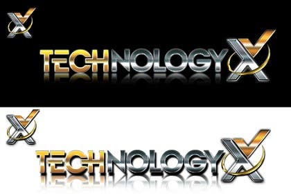
“@D7G won the contest on 29 November 2012”
![]() LesTheSSDReview, Canada.
LesTheSSDReview, Canada.
Veřejná nástěnka k vyjasnění projektu
-

marty1950
- Před 11 let
Oh well, my #198 went only so far. At least my idea of the partial moon survived when D7G copied it in his design. Other contest locations that would be grounds for disqualifying of his entry. I do not agree with that policy. However, I must say this. You mentioned to me in an earlier message that you were concerned about how my text would appear on a white background (being too light). D7G's entry seems to be to the other extreme. It appears too dark. Just FYI. I have had fun here and was glad that I managed to get a 5 star rating from you, although briefly. The competition in your SSD Review contest that I endured let me know what I was in for in this contest. Making it to this point in your contest was a compliment ot my work. Thank you so much for that. Good luck with this and I'll see you in your next contest...
- Před 11 let
-

Doctor007ADB
- Před 11 let
Do it same and get winner rank because you deserve it, make a logo same like 310 and make x in different style and get because contest holder is smart guy and he want only a perfect logo not a talent :)
- Před 11 let
-
Doctor007ADB
- Před 11 let
Any reason for reject logo?
- Před 11 let
Zobrazit 1 další zprávu
-

creativegurus
- Před 11 let
lolz :) :D
- Před 11 let
-
Doctor007ADB
- Před 11 let
#310 is not fit for winner bcs looks very dull and not professional
- Drop shadow or mirror effect is just a technique in it but it not look as mirror or water effect :(- Před 11 let
-
Doctor007ADB
- Před 11 let
Ok friend rate it #322
- Před 11 let
-

majidshah777
- Před 11 let
If you want some editing on my logo ,then i am here!
- Před 11 let
-

Aadesh19
- Před 11 let
Kindly consider #306
- Před 11 let
-

pankhurikalra
- Před 11 let
sir plz check #304
- Před 11 let
-
Aadesh19
- Před 11 let
#302
- Před 11 let
-
Aadesh19
- Před 11 let
Please check #301
- Před 11 let
-

akshaydesai
- Před 11 let
Please check Private Message
- Před 11 let
-

pandojevito
- Před 11 let
please check #297
- Před 11 let
-

komal07
- Před 11 let
Hi, please check #258
- Před 11 let
-
akshaydesai
- Před 11 let
Sir
Please check Private Message- Před 11 let
-

XyloStylo
- Před 11 let
.
- Před 11 let
-

sawantamey
- Před 11 let
Please feedback for my design #238,#239,#240. Thanks
- Před 11 let
-

wskymaster
- Před 11 let
Please feedback for my design #236 . Thanks
- Před 11 let
-

usconsultoria
- Před 11 let
Please check #232
- Před 11 let
-

GDesignGe
- Před 11 let
Why you reject my entry?
- Před 11 let
-

websitedesilxquo
- Před 11 let
Please check #200, T and X both are used in iconic symbol, thanks....
- Před 11 let
-

umeraqeel
- Před 11 let
plaese check #182 thank
- Před 11 let
-

sirrom
- Před 11 let
g ' day, please check #161. thanks - sirrom
- Před 11 let
-

wa6
- Před 11 let
chek #81
- Před 11 let
-
wa6
- Před 11 let
#152
- Před 11 let
-
Pořadatel soutěže - Před 11 let
I just wanted to clarify the way that I choose to follow through with this contest. First and foremost, PLEASE dont get insulted if I reject your design without reply. I believe that by being honest and only keeping those that I would consider, I m able to help the rest in seeing what I prefer (ie try color metalic/logo/logo behind or to rear of word.) Anyone who has communicated here knows that I have been very upfront of what I think might work. As well, the winner will get more work aswe are opening yet another site shortly and will needs tech awards for this site.
Thanks ahead all!- Před 11 let
-

didiwinata
- Před 11 let
please check #127
- Před 11 let
-
didiwinata
- Před 11 let
#131
- Před 11 let
-

ejom
- Před 11 let
Pleae check my entry in #103 and #104 Please.
Comment or suggestion will be very appreciated.
Thanks
ejom- Před 11 let
-
sirrom
- Před 11 let
Hi, please check #95. thanks - sirrom
- Před 11 let
-
Pořadatel soutěže - Před 11 let
Some things I like in the ones I have kept.
In the first, I love that color and the icon as a logo is decent. In the second, love the design but would love to see the tri-color gold utilized. In the fourth, I LOVE that logo and , if you might checnge the lettering style, you have a heck of a chance. In the sixth, I love how tech is a diff color metalic than the rest of that word.- Před 11 let
-

Papple
- Před 11 let
have look on 83
- Před 11 let
-

fivezones
- Před 11 let
Hi CH, Please Check #76, #77, #78, #79. Thnks...
- Před 11 let
-

ideazz13
- Před 11 let
hi, plz guarantee and sealed the contest. thx
- Před 11 let
-
Papple
- Před 11 let
like to have feedback on 74 and 75
- Před 11 let
-
Papple
- Před 11 let
like to have feedback on 73
- Před 11 let
-

bilalpk786
- Před 11 let
please review #72
- Před 11 let
-
bilalpk786
- Před 11 let
please review 72
- Před 11 let
-
bilalpk786
- Před 11 let
please rate #68
- Před 11 let
-
bilalpk786
- Před 11 let
Please review #65 , #66 , #67 , #68 . Revisions can be done as well
- Před 11 let
-

aliraza91
- Před 11 let
Hi,
Please have a look #61, #62, #63.
Thanks & Best Regards- Před 11 let
-
Pořadatel soutěže - Před 11 let
I am not keen on pastel colors like blue and orange.
I like metallics such as bronze gold and platinum.
I like the thought that tech is a different shade than technology.
I might suggest something similar to the logo at http:TheSSDReview.com
I like the thought of the x behind and to the rear of technology.- Před 11 let
-
Pořadatel soutěže - Před 11 let
I always use http://thessdreview logo as an example and my shirt and business card reproductions are perfect with that. That was a contest won here as well...
- Před 11 let
-

murraysmart
- Před 11 let
Oh fair enough, I'm not saying you can't place gradient filled logos onto shirts, I"m just saying that digital printing is more expensive than screen printing and that screen printing does not allow for gradient fills to be replicated.
May I enquire which portion of my current approaches you do like and which aspects were unsuitable please.- Před 11 let
-
sirrom
- Před 11 let
please check #45, #46, #47. thanks - sirrom
- Před 11 let
-
bakkihan
- Před 11 let
#32 hellooooooo waiting for any feedback
- Před 11 let
-
badhrinath4
- Před 11 let
hi, pls check on #22
- Před 11 let
-
sirrom
- Před 11 let
Hi, please check #21. thanks - sirrom
- Před 11 let
-

nikster08
- Před 11 let
If u would seal the contest and guarantee it then you can attract more designers and will be best for you.
- Před 11 let
-
Pořadatel soutěže - Před 11 let
Why would I guarantee such if I cannot guarantee a logo will be suitable? Conversely, if someone believed they had the quality, they obviously would enter and win. Funny part is this is only the beginning as we are a major corporation and this is but one of our businesses.
- Před 11 let
Jak začít se soutěžemi
-

Zveřejněte svou soutěž Rychlé a snadné
-

Získejte spousty návrhů Z celého světa
-

Zvolte nejlepší návrh Stáhněte si soubory - Je to snadné!